Accordion Icons: Which Work Best?
Smashing Magazine reports on the most reliable icons for showing expansion and collapsing in accordions, citing research from NN/g. The caret is found to be the safest icon choice.
Original reporting · smashingmagazine.com
Read “Accordion Icons: Which Work Best?” at Smashing Magazine →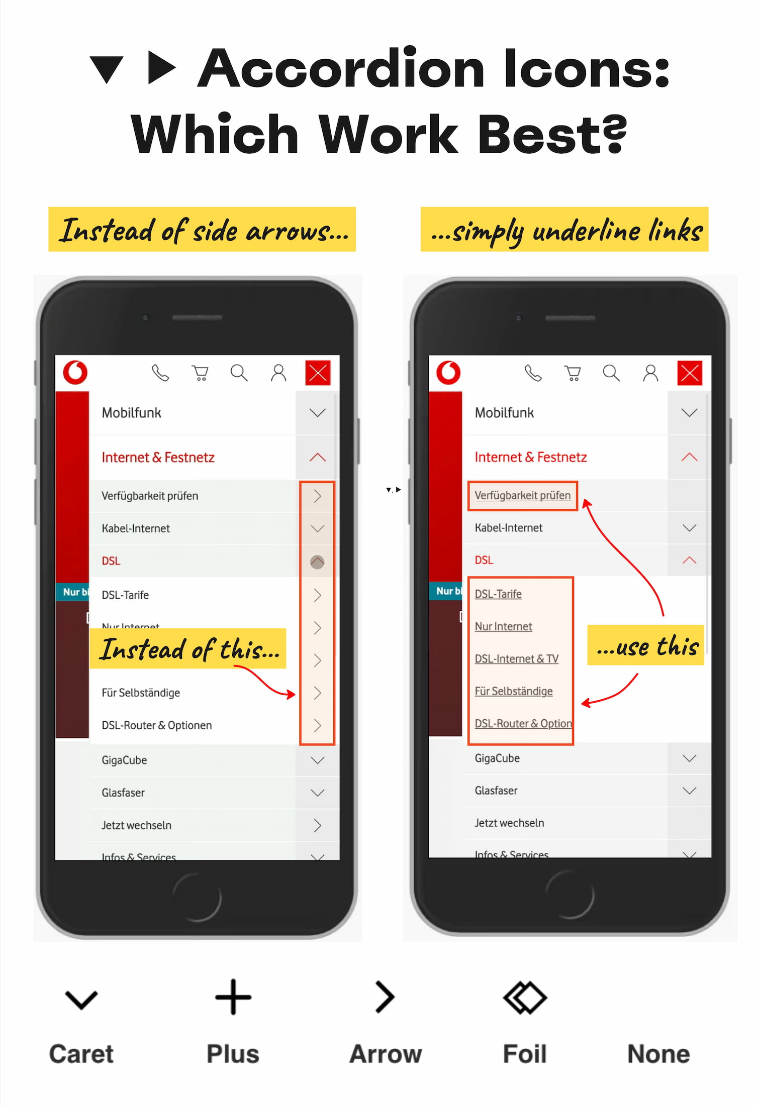
How this was written. Content Memory wrote this article with a language model from Smashing Magazine’s reporting (model: @cf/meta/llama-3.3-70b-instruct-fp8-fast); it describes that reporting rather than adding to it. The original, linked above, is the full story.
Key points from Smashing Magazine’s report
- The caret is the safest icon choice for accordions, as it clearly signals opening and closing.
- Split menus can be harmful and should be avoided in accordion design.
- Icons and text labels should not link to different actions to avoid user confusion.
Smashing Magazine published an article on October 23, 2026, examining the effectiveness of various accordion icons. According to Smashing Magazine, research from NN/g reveals that the choice of icon can significantly impact user experience. The study found that some icons are more reliable than others in indicating expansion and collapsing in accordions.
The article highlights the importance of clear and consistent icon design. It notes that split menus can be harmful and that icons and text labels should not link to different actions. Smashing Magazine reports that the caret is the safest icon choice, as it clearly signals the opening and closing of accordions.
The NN/g study found that users often struggle with custom icons, as they do not clearly indicate the action that will be taken. In contrast, the caret is a simple and effective icon that works well in most cases. The study also found that users tend to tap fairly equally on the icon and the label, except for the caret, where they tap more on the icon.
The article also discusses the use of arrows and other icons in accordion design. It notes that using a right-facing arrow icon is not associated with the expectation of going directly to a new page. Additionally, having the same icon pointing down does not necessarily imply that an accordion will open on tap or click.
Smashing Magazine suggests that the rule of thumb for accordion icons is simple: if it's a link, underline it, and if it opens an accordion, use a caret. The article also advises against using split buttons for accordions, where the text label links directly to a page, but the icon opens the accordion.
The article concludes that the caret is a safe and effective choice for accordion icons. It also notes that plus and minus signs, as well as arrows, can be used, but may be overloaded with different meanings. Ultimately, the key to effective accordion icon design is simplicity and consistency.
Smashing Magazine's evaluation of accordion icons provides valuable insights for designers and developers. By following the guidelines outlined in the article, they can create more user-friendly and intuitive interfaces. The article is part of Smashing Magazine's ongoing effort to provide useful guides and resources for the design community.
Questions and answers
What is the most reliable icon for showing expansion and collapsing in accordions?
The caret is the most reliable icon, as it clearly signals the opening and closing of accordions.
Why are split menus harmful in accordion design?
Split menus can be harmful because they can cause user confusion, with the text label linking to a different action than the icon.
What is the rule of thumb for accordion icons?
The rule of thumb is to underline links and use a caret for accordions, avoiding split buttons and custom icons that may cause confusion.